Did you know even big-name coaches and business owners have ugly funnels? Their images are stretched out, the pictures are low resolution, and every single funnel they have look totally different. And when I say different, I mean, literally.
Even for these gurus, design is always treated as a luxury and an afterthought but it doesn’t have to be.
Provided you have the most important things in your funnel in place – great offer, copy, traffic – let’s talk about 6 design mistakes you’re making that could be hurting your funnel conversions. Then we’ll discuss solutions on how to fix them so you can create a beautifully designed funnel that accentuates your offer — all without breaking your bank.
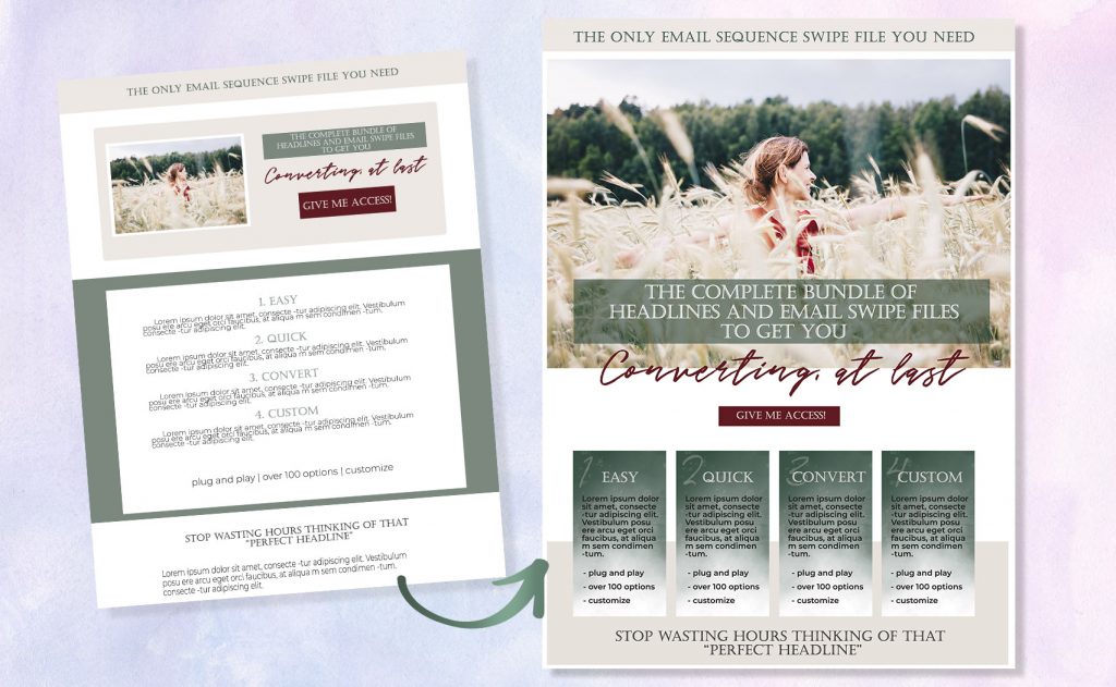
1. Inconsistent Branding
I’ve seen SO many business owners that have multiple funnels that look inconsistent throughout. For example:
- their combinations of colors are not the same,
- there are more than 3-4 fonts used,
- every background is different,
- the picture qualities are poop,
- there are no custom favicon used, and
- the footers all look different as well.
If I may be blunt — some of these pages look like a web page designed in the 90s.
Here’s a solution: create a brand board that includes your fonts, colors with hex codes, background images and textures, and logo variations. Keep that as your design guideline and follow it religiously.
2. An overall FLAT-ness
A lot of beginner funnel builders have a hard time creating depth in their funnels. There’s nothing wrong with a simple, minimalist funnel, but for the sake of this blog post, I’ll focus on non-intentional flatness that looks outdated.
A nice picture can surely create a beautiful background with depth but the key here is variation. If every background you have on your page is a faded out image of a laptop and flowers, it’s going to look like every other funnel page out there.
Instead, use patterns and textures to change things up. Just as there are multiple layers to building a funnel, there are also multiple areas where you can add design elements to create some depth in your page.
Click here if you’d like 6 free textures made by yours truly to use on your sales funnel pages, emails, social media, blogs, and more!Funnel builders consist of: sections, rows, columns, and elements. You can add a background or texture to each of these layers if you’d like but make sure you don’t over-bling the page. Remember, there is such thing as an over-designed funnel.
Your funnel focus should be the actual offer and copy that entices the audience to read more. If your design has so many layers and textures, it may take the attention away from the copy. So keep in mind that you want to find a happy medium of giving depth to your page but not overdoing it either.
Add layers and overlapping areas to create depth in your funnel page.
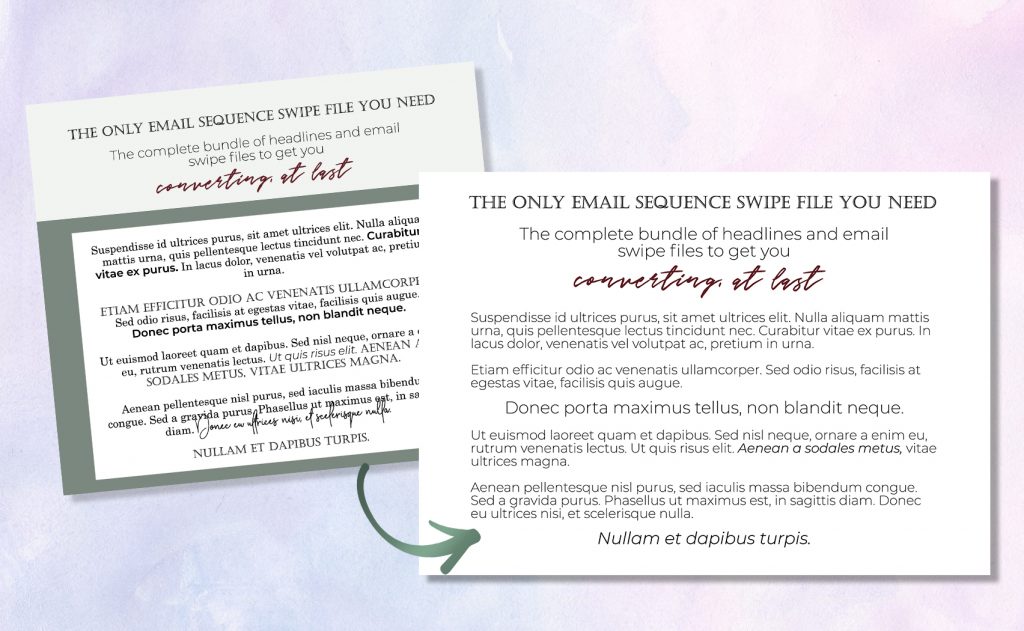
3. More than 3 fonts in one page
You don’t need multiple fonts to create a “designed’ look – I generally use 2 or 3 fonts per page. One for headline fonts, one for body fonts, and another one strictly for accents. Consistent usage of fonts will help tell a visual story, keeping the reader on track and focused on the offer.
If I were to use a serif font for the headlines and body font, I would choose a sans serif for the body. Hand lettered or handwritten fonts are generally saved for accents as most of them can be hard to read.
A pro tip for hand lettered fonts in funnel builders like ClickFunnels — create an image of the words using the fonts instead of trying to upload the font as a digital asset into ClickFunnels software. I tried this once and miserably failed.
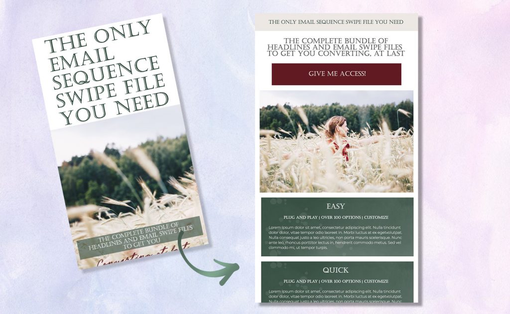
4. Not optimizing for mobile
The majority of my friends and business friends use social media sites on their phones. If you are driving traffic to your funnel through social media ads and posts, it’s also highly likely that they will open your funnel on their phones.
A huge part of optimizing for mobile is changing the backgrounds, size of the fonts, and placements of call to action buttons so that it shows in the first fold of the page. The first thing your audience sees needs to capture their attention and tell them exactly what this page is going to be about. This is true for both desktop and mobile.
Even though we’re conscious of this so many people forget to optimize the funnel pages in mobile. Yes, it’s an extra step but it’s also a huge chunk of audiences you don’t want to lose.
When you finish building and designing your funnel for mobile, make sure you check the page by actually opening it on your phone. It almost always looks different from the way it looks on your funnel editor.
—-
What do you think?
If you found these tips useful and will be implementing them, let me know in the comments below!


Those pages are gorgeous! Great article, Kiyoko!
Thank you Jennifer!
Good read!
Thank you, I appreciate your taking your time to read it!
Great blog post! I really want to be more mindful of optimizing my pages for mobile!
Thank you Chido! It might be extra work but it’s certainly worth it!
Great point! I’ll be talking about this in another blog post too — storytelling and emotional response is such a crucial point of funnel design. Good copywriting plays a huge role but design accentuates great copy 🙂